BURBERRY

Burberry01.png

OVERVIEW

I was approached bu Burberry to create a small but very stylised icon set for their recent website redesign. The icons were needed at a fair few sizes depending on where they were going to be used. I also created a set of very specific guidelines for any future iconography.

AESTHETIC

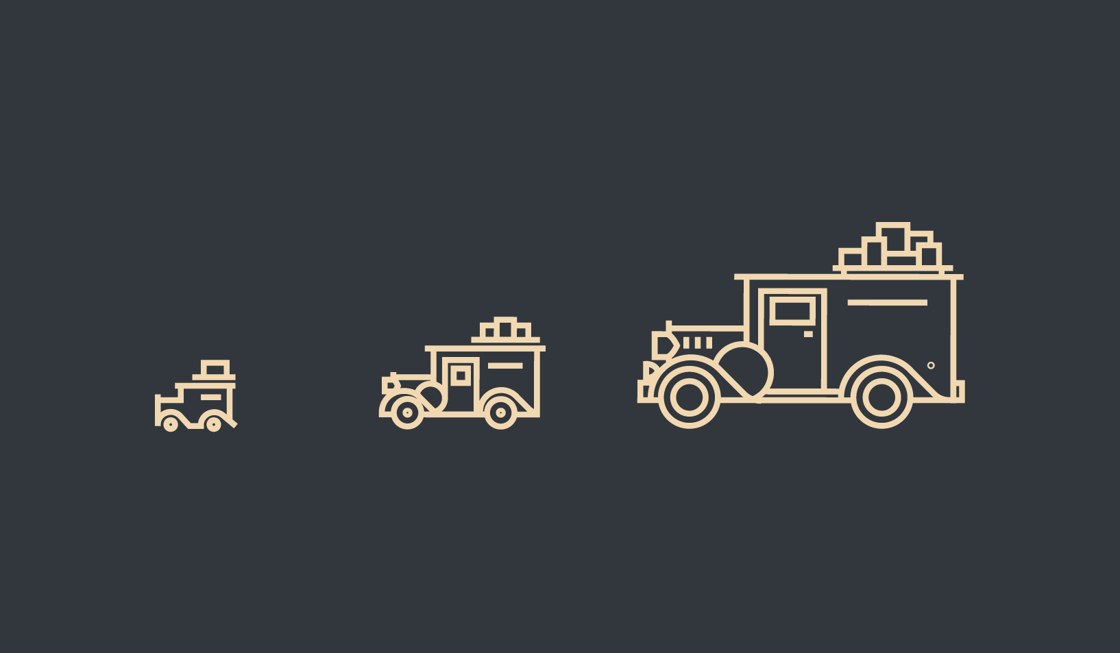
Working with such a known, well established brand, myself and the web team discussed keeping that classic Burberry aesthetic very much alive in a modern icon set. I started with the vintage Burberry delivery van and the famous Regent Street storefront in London.

Burberry van exploration

Burberry van exploration

Size and detail exploration

Size and detail exploration


 EXPLORATION

Next up I jumped into the icon set and applied those styles and guides that I explored for the more important icons. I explored the set at 2 sizes and really wanted to keep that aesthetic for a few of the icons, vintage and classic to keep everything consistently Burberry.


ICONOGRAPHY

Here are the final system of needed iconography including a 14px set and a 28px using two different line weights.

28px set

28px set

14px set

14px set


GUIDELINES

I created a set of guidelines for future use on the Burberry icon set, I tried to be as thorough as possible with this process as the icon system needs to be so tightly in line with the globally recognised brand.

burberry-08.png